Fisdap Instructor Tutorial: Eureka Graphs

The concept underlying the Eureka Graph originated from Dr. M.E. Wilson in England in 1991. Wilson studied 12 ambulance staff members, 14 Royal Navy medical assistants, and eight medical students during a two or three week training attachment to the department of anesthesia at the Royal United Hospital in England.
Wilson used a simple graph to chart each participant’s intravenous cannulation (IV) and endotracheal intubation (ET) attempts. For each successful attempt, the student’s graph climbed one notch and for each failure the graph descended one notch. Participants and staff reported that they found this method of charting their progress enjoyable.
Wilson defined competency as the point at which the slope of the curve on the participant’s graph reached a consistent 39 degree elevation (corresponding to an 80% success rate). In order to claim evidence of mastery, Wilson suggested that the student’s performance curve needed to stay above the 80% mark for more than 20 trials or attempts.
This concept of competency was first introduced to EMS education in the United State by Kim Grubbs from Johnson County Community College (Overland Park, Kansas) at the 1995 EMS Today Conference. We call the point at which the student's performance dramatically improved the Eureka Point.
Here's an explanation of how the Eureka Graph works for field shifts:
- For each successful skill attempt, the student's graph climbs one point; and for each unsuccessful attempt, the graph drops one point.
- When the student reaches an 80% success rate over 20 attempts, the graph shows the moment of skill competence by drawing a dashed line (representing continued 80% success rate) as a continued reference point.
- The colors on the graph help determine a trend in performance. Red indicates that there are fewer than 10 attempts and/or that the success rate is less than 60%. Yellow indicates that the success rate is between 60-79% in the last 10 attempts. Green indicates that the success rate is above 80% in the last 10 attempts.
Some examples:
Example 1

As you can see from the legend at the top of the graph, this is a report that was generated for Student 220. The report was requested for all IV attempts between August 1, 1998, and October 31, 1998. This student had performed 28 attempts in that period of time. This student has not yet reached the point of competency.
Example 2

Student 66 achieved competency in 29 IV attempts. This graph is very typical of most Eureka Graphs. The line hugs the baseline at the beginning, and then begins to gain a steady success climb.
The student remains close to the 80% (dashed) reference line after reaching the competency point.
Example 3

This student also reached a competency point, but did so much later in the program.
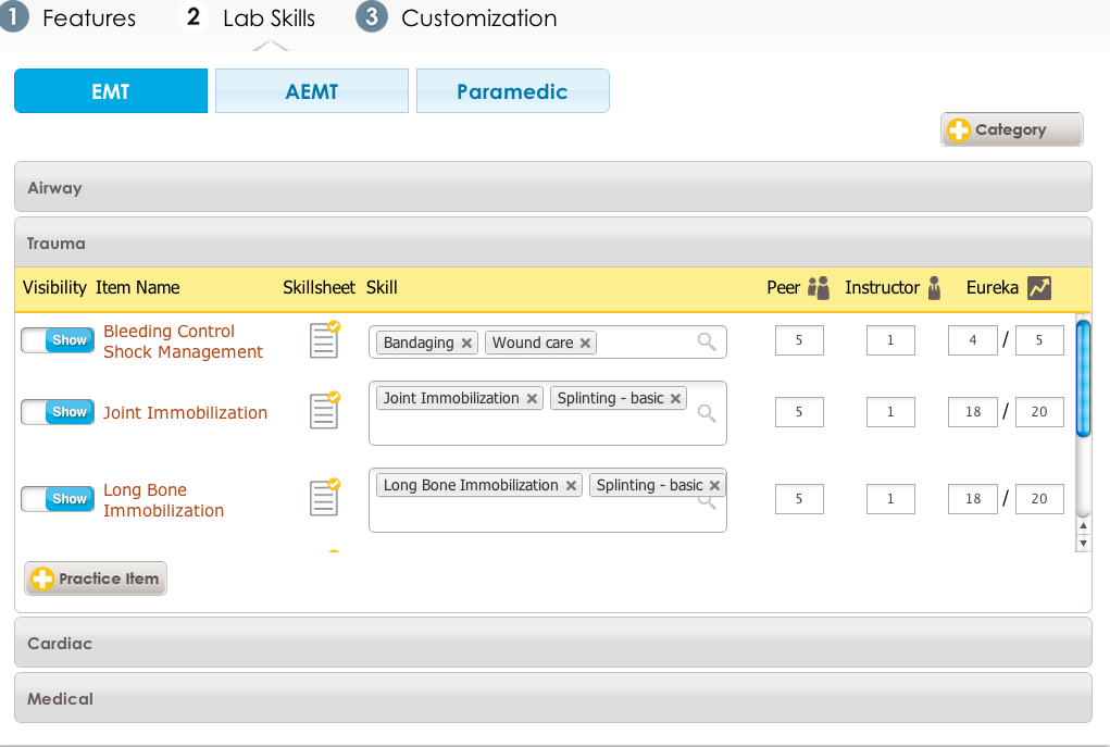
Here's how the Eureka Graph works for lab shifts:
While the Eureka Graph works the same for lab shifts, you have greater greater flexibility with establishing goals for when students hit the Eureka Point.
You can customize the Eureka Graph by setting the numbers for successes over attempts. You could use any numbers that you think are appropriate, and the student will hit the Eureka Point when he achieves X number of successes over Y attempts.
As an example, you could type in 4/5, 16/20 or 80/100 and so on depending on the requirements of your program.
For more information about the origin of the Eureka Graph, you can read the following journal articles: